
Donerji
Dubai, UAE
–
Branding
Custom Typography
Art Direction
Brief:
To brand a new Doner Kabob restaurant in the Middle East region with a fast casual modern language.
Solution:
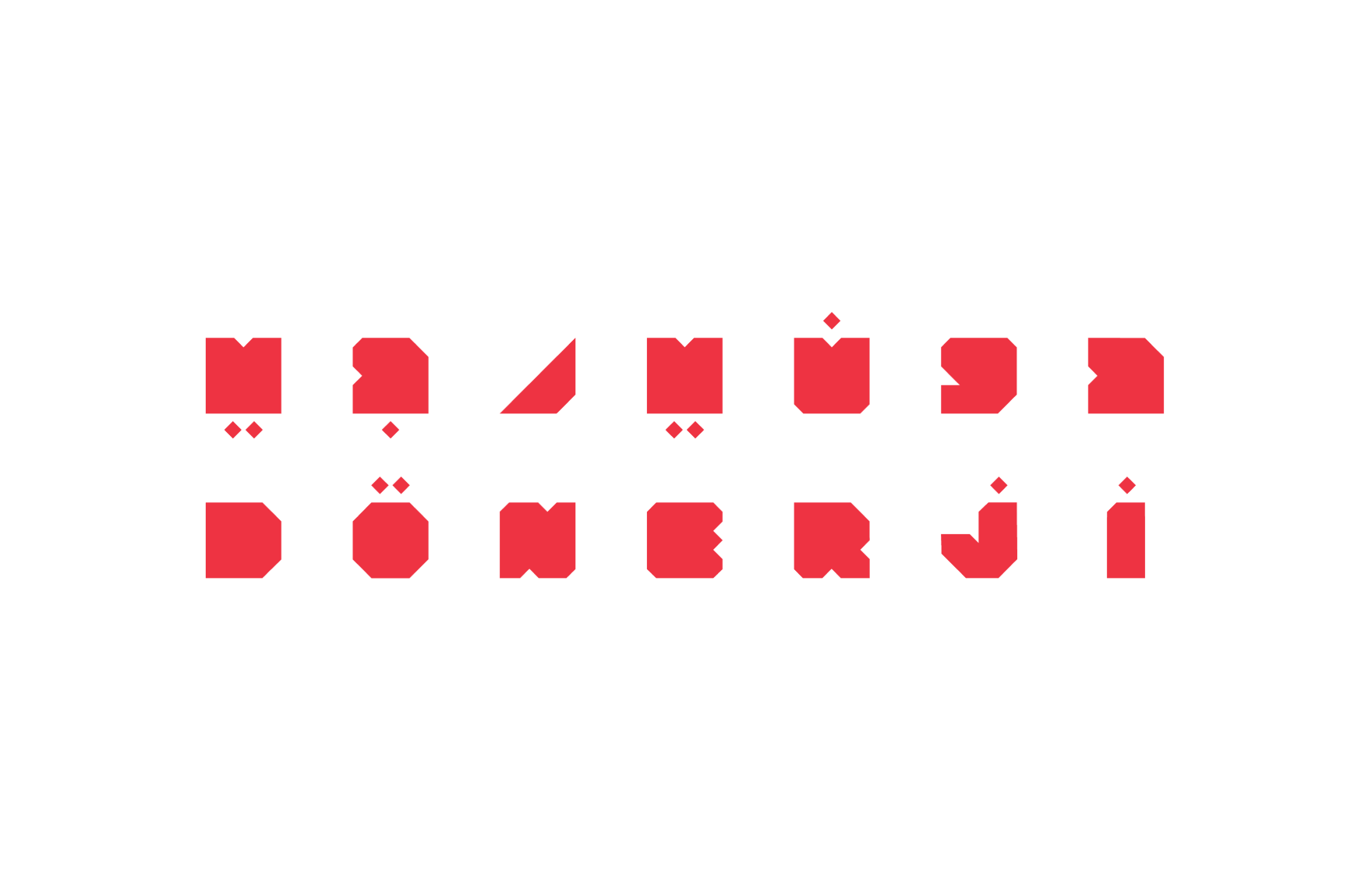
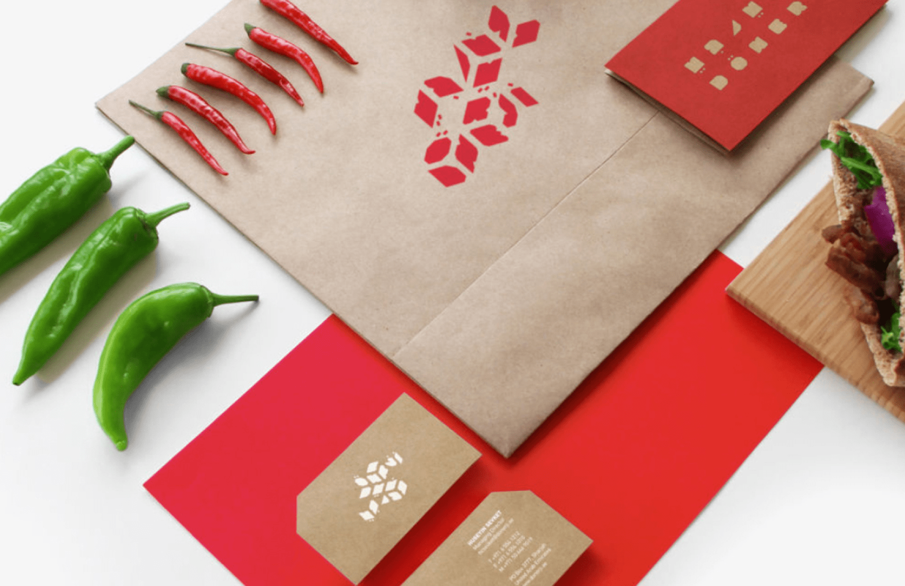
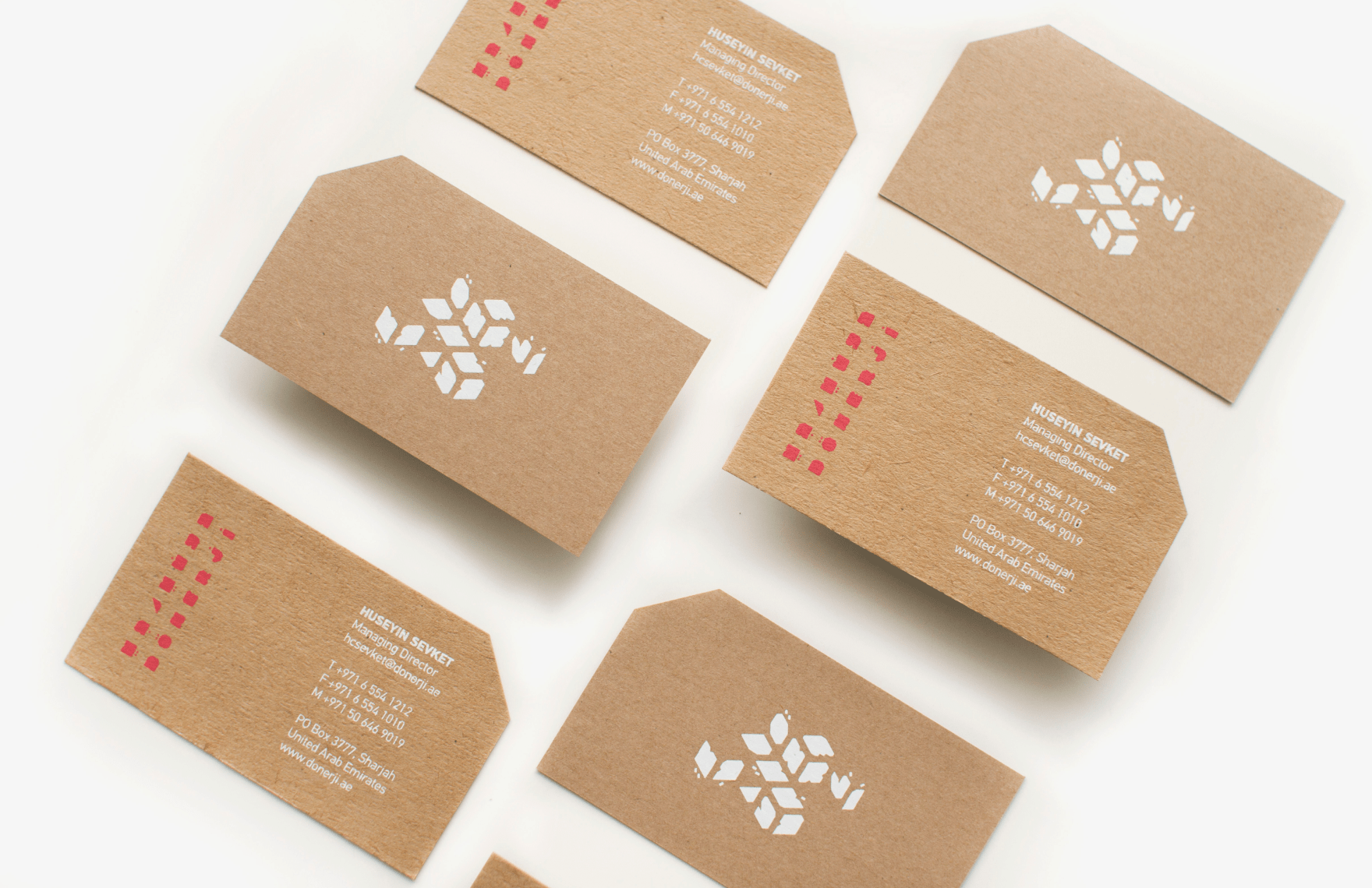
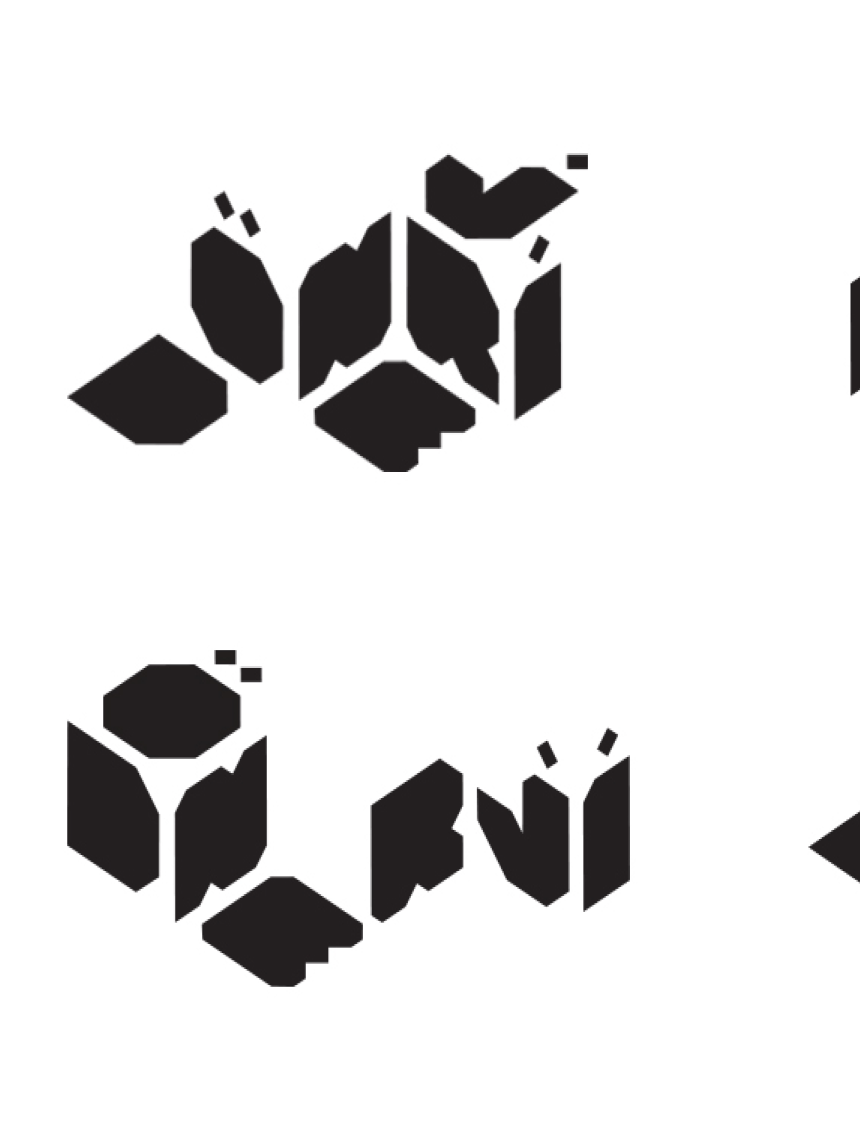
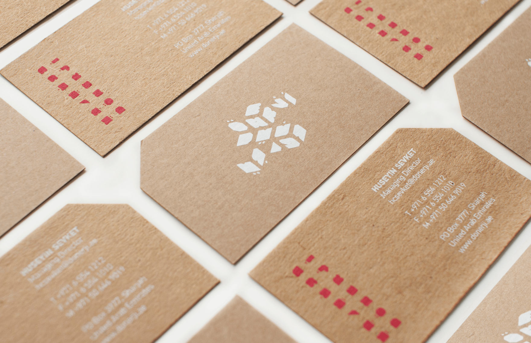
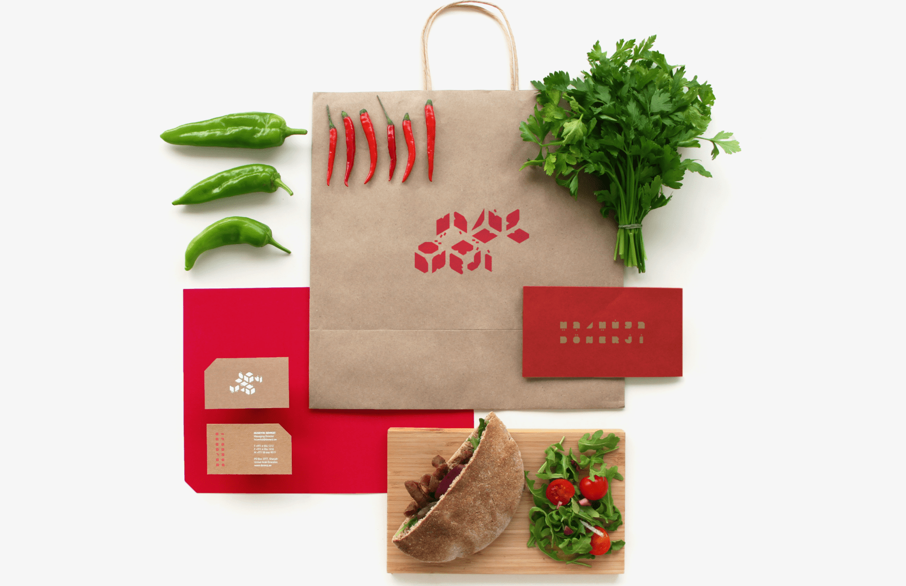
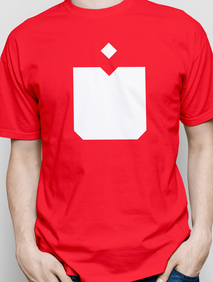
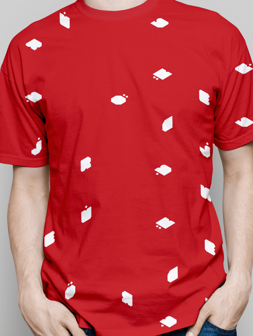
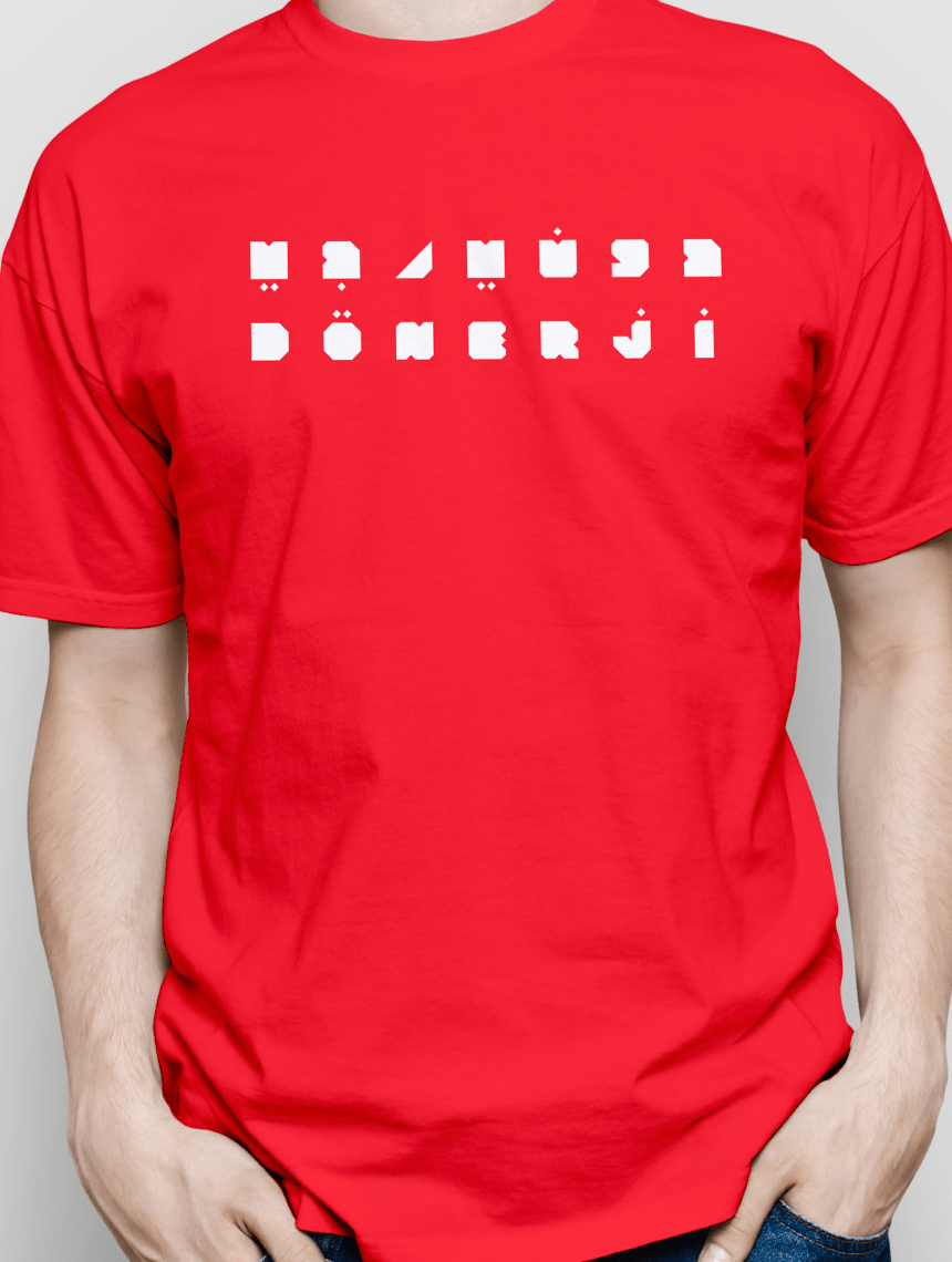
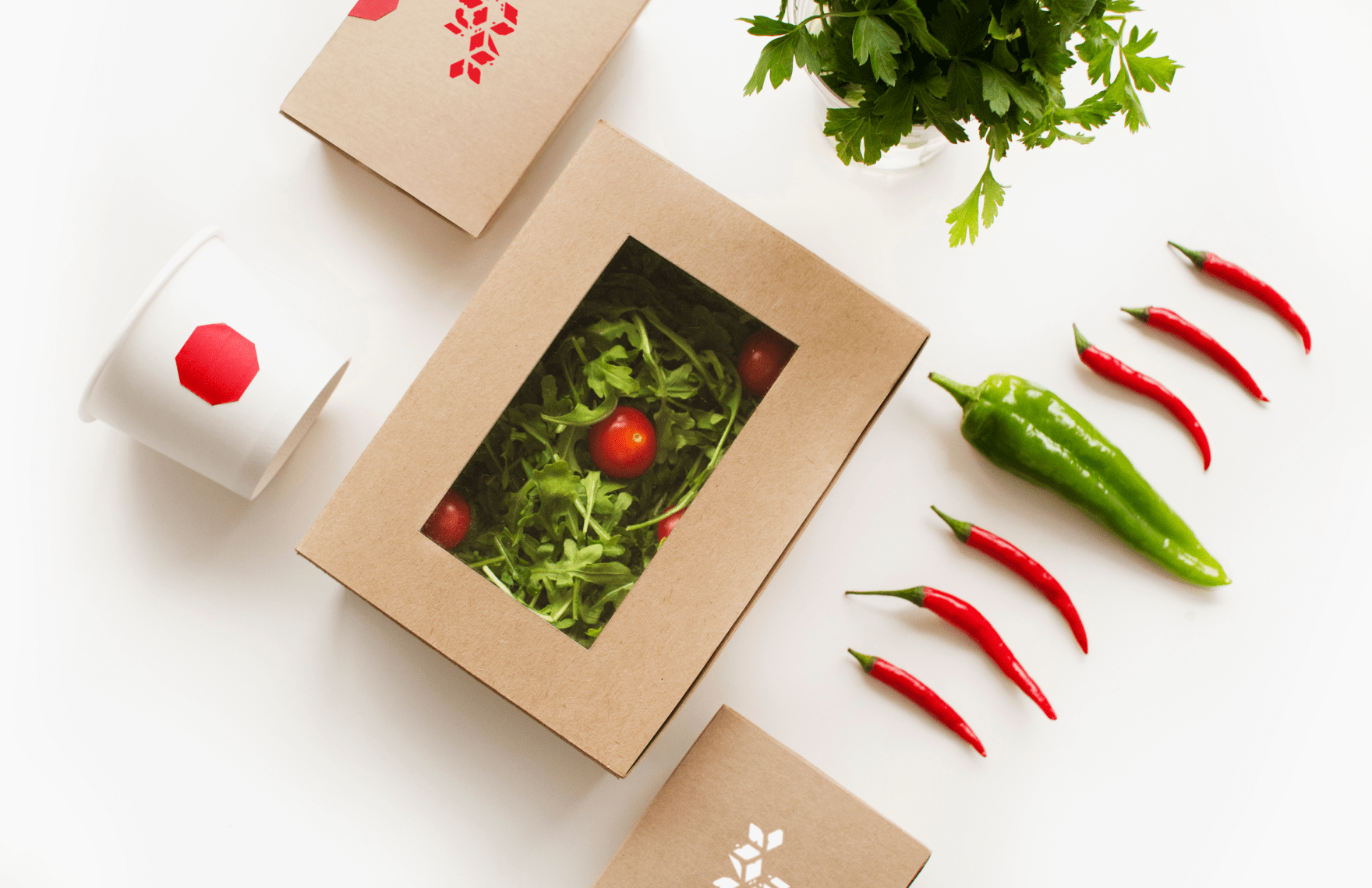
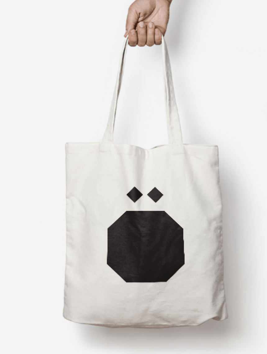
The first challenge was to consider a bilingual approach from the beginning of the design process. We developed a custom character set that reads equally in Latin and Arabic characters in order to establish a dynamic bilingual identity. We took the knife cuts of the meat and sandwich as inspiration to create the typographic characters. After establishing a well balanced identity, we took the characters and created patterns to show customers the combination of dishes through isometric compositions that demonstrate the diversity of food options you can create. The solution is a simple, bold and minimal approach to a once very traditional and classic approach to this food option in the region.
To brand a new Doner Kabob restaurant in the Middle East region with a fast casual modern language.
Solution:
The first challenge was to consider a bilingual approach from the beginning of the design process. We developed a custom character set that reads equally in Latin and Arabic characters in order to establish a dynamic bilingual identity. We took the knife cuts of the meat and sandwich as inspiration to create the typographic characters. After establishing a well balanced identity, we took the characters and created patterns to show customers the combination of dishes through isometric compositions that demonstrate the diversity of food options you can create. The solution is a simple, bold and minimal approach to a once very traditional and classic approach to this food option in the region.
1 /
2 /
3 /
5 /
4 /
6 /
7 /
8 /
9 /
10 /
11 /
/
/